Keen's Vibrant Rebrand: Mother Design Embraces Folk Art to Transform Psychic Guidance
By Editor • September 10, 2026 • 2 min read
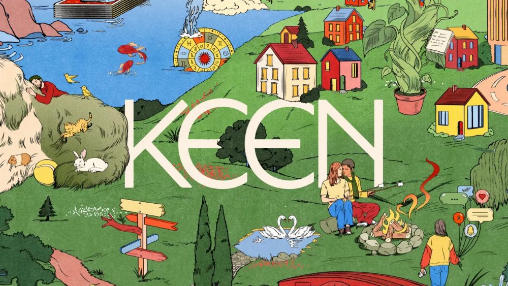
A fresh wave of creativity has engulfed Keen, the online psychic marketplace, thanks to a dynamic rebrand by Mother Design. Departing from the sterile aesthetics of minimalist wellness, the studio has infused the brand with a rich, folk-art inspired identity that breathes life into the often-misunderstood realm of psychic services.
The rebranding initiative aimed not just to modernize Keen, but to shift perceptions around psychic guidance. Creative director Jo Tulej noted the oversaturation of minimalist designs in the wellness sector, stating, "Wellness has become surprisingly uniform… We wanted Keen to feel just as calm and approachable, but in a way that was richer, warmer and unmistakably its own." The result is a vibrant visual identity that resonates with a wider audience.
A New Perspective on Psychic Services
Mother Design's research unveiled a cultural pivot where individuals increasingly seek clarity and support from spiritual advisors, rather than mere predictions about the future. This insight shaped the brand's new direction, positioning Keen as a source of human guidance that stands in contrast to AI and algorithm-driven platforms. The collaboration with illustrator María Jesús Contreras further enhances this narrative, creating an illustrated world that embodies the beauty of everyday life, spirituality, and a bit of whimsy.
Bold Visual Identity and Human Connection
In stark contrast to the subdued palettes typical of wellness brands, Keen's new identity bursts forth in a psychedelic display, echoing the vibrancy of folk art. The design employs a rich color palette inspired by ancient pigments, combining grounding tones with warm neutrals and lively accents. Typography blends expressive serif styles with humanist sans serifs, capturing a balance between ancient wisdom and modern accessibility.
Moreover, the brand emphasizes the human stories behind its platform, showcasing real people through thoughtful photography. The overall verbal identity mirrors this warmth, aiming to foster trust and approachability. As stated by Ariana Hellebuyck from Ingenio, the goal was to create a brand that resonates with contemporary approaches to wellbeing while honoring the spiritual expertise that has always distinguished Keen.
Source: www.creativeboom.com