Phion Symphony Orchestra Unveils Dynamic Identity Inspired by Conductor's Baton
By Editor • August 26, 2026 • 1 min read
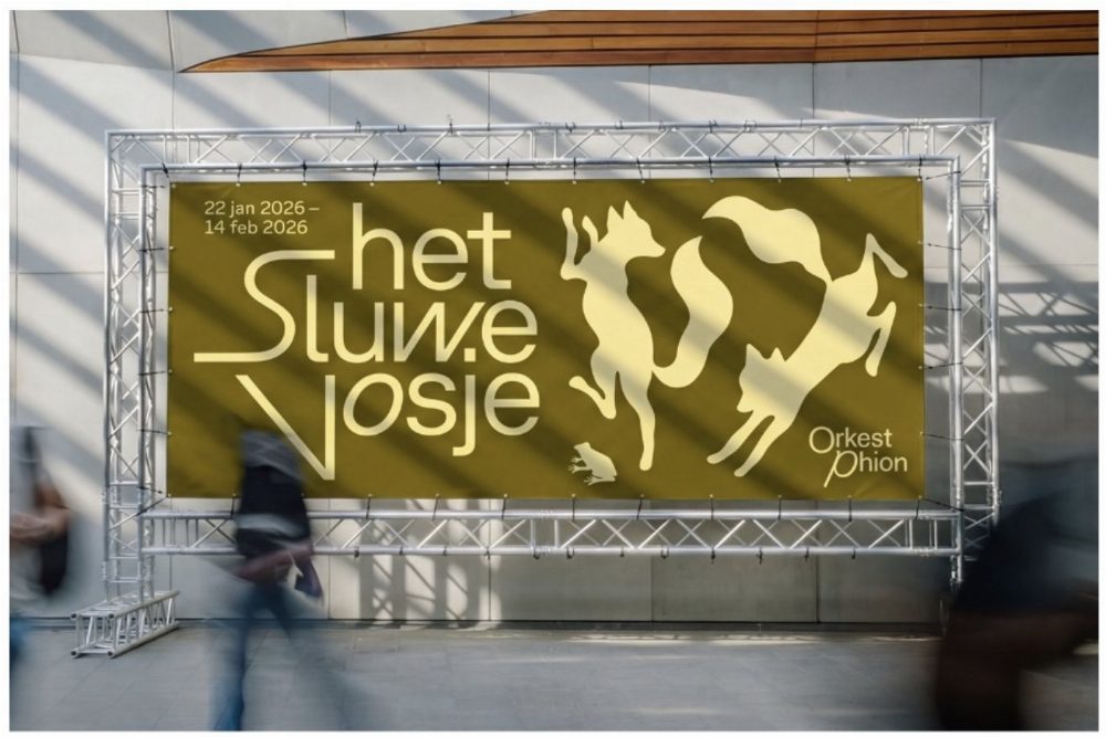
Amsterdam's Studio Thonik has crafted a vibrant identity for the Phion Symphony Orchestra, drawing inspiration from the fluid movements of a conductor's baton. Utilizing Grilli Type's GT Planar, a variable-angle sans-serif typeface, the design adapts to the unique atmosphere of each concert.
Design lead Falco van Burg highlights that GT Planar's continuous slant axis allows for expressive typography that reacts to the music's emotional depth. "When you slant it, additional forms emerge, emphasizing its character," he explains.
With Phion being a traveling ensemble without a permanent venue, the design team focused on music as the anchor of their visual identity. This approach ensures that while each performance has its distinct image, the orchestra remains recognizable. "We start with the music, not the layout," Falco notes, emphasizing the need for typography that resonates with the concert's mood.
Source: www.itsnicethat.com
#design #GT Planar #Phion Symphony Orchestra #Studio Thonik #Typography