The Dimming Palette: How Economic Forces Are Reshaping Japanese Design
By Editor • August 17, 2026 • 3 min read
In recent months, Japanese design has experienced a striking transformation, particularly visible in the snack aisles of supermarkets. A stark example is the new Calbee potato chip packaging that has emerged, which stands in sharp contrast to the vibrant, colorful options typically found on store shelves. The new design, featuring a muted silver color and a minimalist approach, has caught the attention of shoppers as it quietly conveys a much larger narrative about economic shifts.
Beginning in late May, Calbee introduced this subdued packaging across fourteen of its products, a change prompted by geopolitical events affecting raw materials. The war in Iran has restricted supplies of naphtha—the essential petroleum feedstock used in colored inks—forcing the snack giant to adopt a more austere visual identity. This transition mirrors broader trends in the Japanese market, where JA Nakanoshi, the largest mushroom producer in the country, plans to halve its packaging varieties for similar reasons.
As I navigate the intricate landscape of Tokyo design, it's become evident that aesthetic choices are heavily influenced by macroeconomic conditions rather than purely by artistic preferences. The yen has depreciated significantly against the US dollar, losing about 52% of its value since 2020, while stagnant wages and rising living costs add pressure. This economic turbulence inevitably shapes the design landscape, resulting in less diversity and vibrancy in products.
The parallels between the packaging changes and the broader design climate are striking. Just a year prior, I wandered through Shibuya Loft, drawn to a minimalist writing pad labeled simply with “WRITING PAD A5.” This pad, packaged by Yamamoto Paper, was a product of the Tomoegawa Corporation, known for its ultra-smooth Tomoe River paper, highly regarded among fountain pen aficionados. However, the company restructured in 2021, leading to the discontinuation of niche paper products as manufacturers face financial strains exacerbated by the pandemic.
Yamamoto's manifesto accompanying the writing pad reveals a heartfelt plea for the preservation of traditional paper types, as the industry faces severe consolidation. Japan's once-diverse array of paper formulations is shrinking, prompting manufacturers to focus on best-sellers rather than less profitable options. The note concludes with a stark warning: “We hope you will enjoy the wonderful feeling of writing on these papers as it may only be a matter of time before they disappear forever!”
This sentiment resonates across the design field. The constraints that limit the availability of unique materials also dictate the outcomes of graphic design projects. In many cases, studios like mine are forced to rely on online printing services that prioritize efficiency and cost-cutting, limiting the range of available materials and finishes. Watanabe-san, who manages production at a local offset shop, confirmed that the rising costs of ink, machinery, and paper have reached a tipping point, impacting every aspect of the industry.
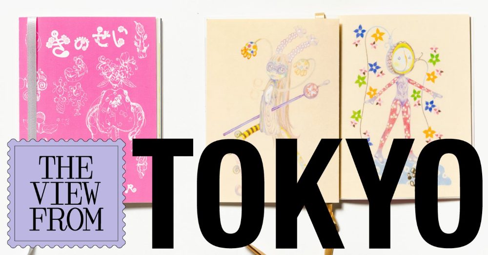
Despite these challenges, there is a glimmer of hope amidst the constraints. Watanabe-san noted a shift toward smaller independent creators who are thriving by seeking unique solutions. This shift has prompted a resurgence in bespoke projects that prioritize creativity within tighter budgets. Art director Taeko Isu shared her experience designing a zine for an exhibition, cleverly utilizing colorful ribbon binding instead of traditional methods, showcasing that innovation can emerge from limitations.
As economic pressures continue to reshape the design landscape in Japan, it's clear that the visual language we encounter reflects not only individual creativity but also the broader economic forces at play. This evolution, while leading to less color and texture, also fosters a new kind of ingenuity that could redefine what design means in a rapidly changing world.
Source: www.itsnicethat.com
#Calbee #economy #Japanese design #packaging #Tomoe River #Yen