The Evolution of the McDonald's Logo: From Speedee to the Golden Arches
By Editor • August 20, 2026 • 1 min read
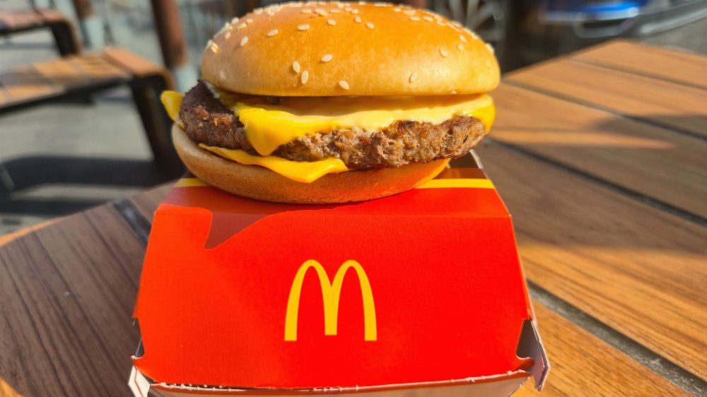
The iconic golden arches that form the letter 'M' have become synonymous with McDonald’s, representing not just a fast-food chain but a symbol of American culture. However, in 1948, when the McDonald brothers first launched their hamburger stand in San Bernardino, California, the logo was far from recognizable.
Back then, the restaurant's signage featured the mascot Speedee, a character with a round face and chef's hat, alongside a simple advertisement for $0.15 hamburgers. As the brothers sought to modernize and attract more motorists, they enlisted architect Stanley Clark Meston to design a new building. Richard McDonald proposed the initial concept of arches as a memorable symbol, which Meston transformed into a striking architectural feature.
By 1953, the revamped design showcased two arches flanking the building, along with Speedee’s sign. It wasn’t until Ray Kroc entered the scene in 1954 that the logo truly evolved. Kroc, who would later take control of the franchise, commissioned an updated logo incorporating the M-shaped arches. This design underwent further refinements, ultimately leading to the simplified version we recognize today.
Source: www.thetakeout.com
#golden arches #logo evolution #McDonald's #Ray Kroc #Speedee