Manchester City Women Unveils Unique Brand Identity, Setting a New Precedent in the WSL
By Editor • September 8, 2026 • 2 min read
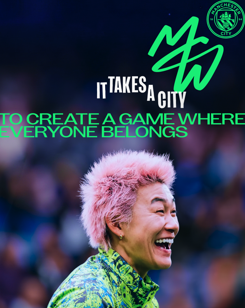
In a groundbreaking move for women's football, Manchester City Women has launched its very own brand identity, becoming the first team in the Women’s Super League (WSL) to do so. This fresh identity, crafted by Nomad Studio, aims to resonate deeply with women-first fans and reflects a significant shift in the club's approach following extensive research into its diverse audience.
A Tailored Approach to Branding
The decision to create a distinct brand for the women's team comes after Manchester City's remarkable success in the 2025/26 season, where they clinched both the league title and the FA Cup. According to Sally Sheppard, the director of marketing, this accomplishment highlighted the necessity of a cohesive branding strategy to communicate the team’s pioneering spirit and ambition. “We needed a more consistent way to tell the story of the women’s team,” Sheppard stated.
Understanding the Fan Base
Deep internal research revealed that the audience for Manchester City Women diverges significantly from that of the men's team. The club identified three core fan groups: 'men’s-first fans', 'women’s-first fans', and a smaller segment of 'equally-interested fans'. The women's-first demographic largely consists of younger women, families, and members of the LGBTQ+ community, prompting the club to seek a more relevant connection with this vibrant group.
A Symbol of Unity and Ambition
The new brand identity is encapsulated in a striking monogram that combines the letters M, C, and W, designed to resemble a 'light trail', symbolizing guidance and connection. This creative endeavor emphasizes the message that Manchester City Women is not just a football team, but a community and a family. “It takes a city” serves as the guiding tagline, reinforcing the unity of players, staff, and fans alike.
With plans for further rollout, including diverse retail options, the new branding promises to enhance the match-day experience through vibrant colors while maintaining the iconic City sky blue. Sheppard expressed enthusiasm about the fresh direction, stating, “I think we’ve struck the right balance between connection and distinction, and it’s going to be really interesting to see how that goes moving forwards.”
Source: www.itsnicethat.com
#Brand Identity #football #Manchester City Women #Nomad Studio #Women's Super League