Manta Chocolate's Bold New Identity: A Fusion of Purity and Indulgence
By Editor • September 7, 2026 • 1 min read
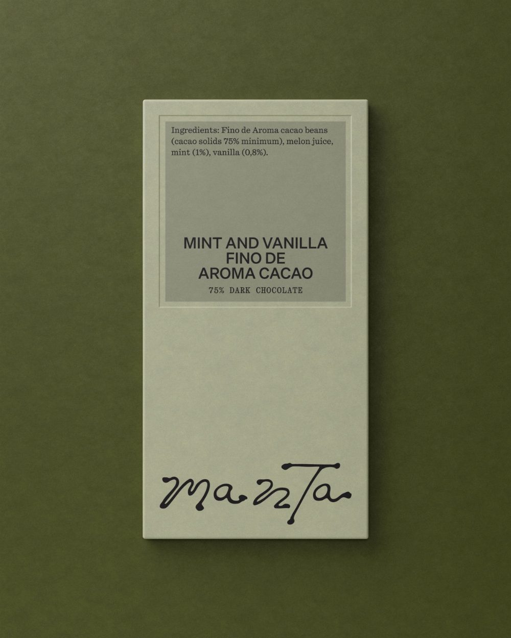
Studio Tyrrell has redefined the branding for Manta Chocolate, emphasizing a unique blend of nutrition and indulgence through its minimalist approach to ingredients. Unlike traditional chocolatiers that focus on rich flavors and excess, Manta prioritizes health with its selection of raw, plant-based, and unrefined components, steering clear of dairy, gluten, and refined sugars.
A New Approach to Chocolate Branding
Oliver Tyrrell, founder of Studio Tyrrell, highlighted the stark contrast between Manta's simple ingredient list and the typical opulence associated with chocolate. The design studio aimed to capture this dichotomy, creating a visual identity that celebrates both the purity of the ingredients and the pleasure of savoring chocolate. The result is a striking combination of an elegant square label paired with a fluid logotype, placing the ingredients prominently on display rather than relegating them to fine print.
Visual Language that Evokes Luxury
To create a connection between the health-conscious nature of Manta's products and the luxurious experience of chocolate, Studio Tyrrell developed a rich visual language. This includes the use of color, texture, and organic shapes that evoke a tactile experience. The logo embodies this philosophy as well, featuring a handmade element that disrupts the otherwise structured design, introducing a sense of imperfection that aligns with Manta's ethos.
Chocolate Reimagined
Every aspect of Manta Chocolate's branding serves as a testament to the idea that chocolate can be both nourishing and pleasurable. As Oliver Tyrrell puts it, the brand finds its own niche within the chocolate world, suggesting a fresh perspective that invites health-conscious consumers to indulge without compromise.
Source: www.itsnicethat.com
#branding #design #Manta Chocolate #nutrition #Studio Tyrrell