Guinness Unveils Innovative Campaign with a Clever Typographical Twist
By Editor • September 9, 2026 • 2 min read
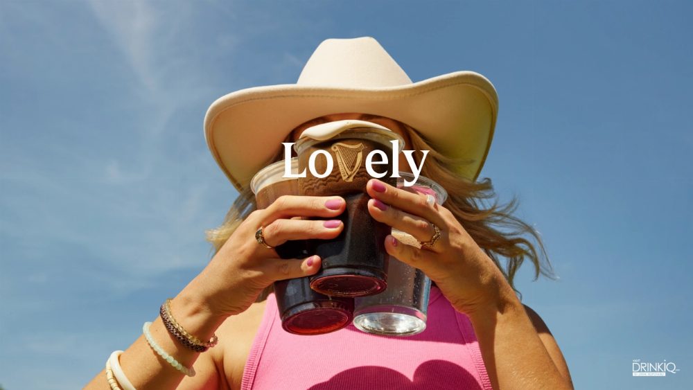
In an exciting new campaign titled 'LoVely,' Guinness has ingeniously woven its iconic harp symbol into the fabric of its branding without the need for a complete redesign. This clever tactic not only modernizes the brand but also respects its storied heritage.
A Rich Advertising Legacy
For the first 170 years of its existence, Guinness refrained from advertising, believing that the quality of its stout was sufficient to attract customers. However, after World War I, a dip in sales prompted the family behind the brand to shift gears, establishing a firm commitment to maintaining high-quality advertising that mirrored the excellence of its beer. This long-standing tradition has resulted in an impressive legacy of creative campaigns, and 'LoVely' continues this trend.
A Brilliant Design Strategy
The crux of the 'LoVely' campaign is simple yet effective: by replacing the letter 'v' in the word 'Lovely' with the harp logo, Guinness creates a seamless integration that feels both fresh and familiar. George Hackforth-Jones, AMV BBDO's global creative director, aptly notes, "Sometimes the best ideas are right in front of you." This strategy showcases restraint and cleverness, as the harp's natural shape closely resembles the letter 'v,' allowing for a harmonious blend without distortion.
Reviving a Classic
The campaign also pays homage to the long-standing tagline, "Lovely Day for a Guinness," which dates back to the 1930s and was revived last year. According to Stephen O'Kelly, global brand director for Guinness at Diageo, 'LoVely' breathes new life into this classic slogan, making it relevant to today's audience across various markets. The campaign's visuals, captured by photographers Dan Burn-Forti and Peter Franklyn Banks, reflect authentic moments that resonate with everyday life, from festivals to football matches.
'LoVely' has launched in Ireland and Great Britain, with plans for expansion into Africa and Asia-Pacific. This campaign demonstrates that sometimes, a brand doesn't need a completely new logo; it just requires an insightful approach to reveal the potential already inherent within its existing assets.
Source: www.creativeboom.com