Instagram Unveils Major Brand Refresh: A Nod to Community and Creativity
By Editor • August 13, 2026 • 3 min read
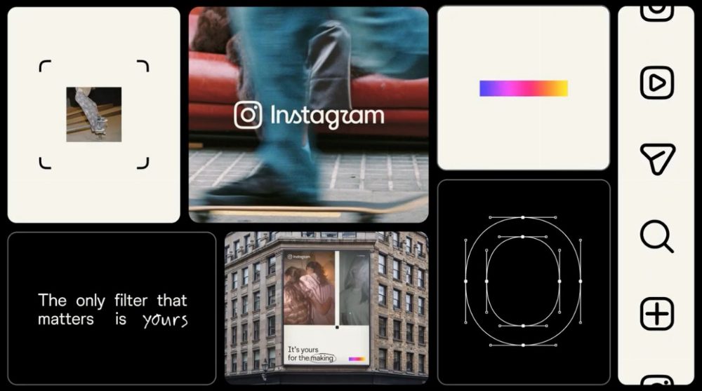
In a significant overhaul after a decade, Instagram has revealed a refreshed brand identity that captures the platform's evolution and the diverse creativity of its users. Creative director Christy Silva and brand design director Cynthia Pratomo shared insights about this exciting transformation, highlighting how Instagram is adapting to its multifaceted community.
Instagram's journey began with a straightforward vision: to connect people through shared visual experiences. The iconic camera glyph, set against a sunset gradient, became synonymous with the app. However, as the platform matured, the need to reflect its broader community became evident. Silva explained, “Growing up means acknowledging there are more sides to Instagram now,” indicating that the platform now encompasses a rich variety of tones and messages.
This brand refresh marks a departure from the singular voice of Instagram’s earlier years. Instead of merely presenting a polished, curated aesthetic, the new identity embraces the raw and authentic nature of user-generated content. Pratomo describes this shift as Instagram “growing up,” recognizing that the app now showcases everything from professional campaigns to candid moments captured by users, all existing side by side.
At the heart of the redesign is a commitment to celebrating creativity in its many forms. Silva emphasized that the new system aims to “actively champion everyday creativity,” making imperfection a normal part of the sharing experience. This perspective is rooted in the idea that Instagram is less about self-promotion and more about fostering a genuine community of creators.
The team also sought to incorporate tactile elements that resonate with the act of photography itself, steering clear of fleeting design trends. By integrating references to traditional photographic processes—like contact sheets and annotations—the redesign aims to celebrate the tools and rituals of image-making. Pratomo noted that these elements are not borrowed aesthetics, but rather intrinsic to the way users interact with the platform every day.
A standout feature of the new identity is the introduction of a viewfinder graphic, reminiscent of camera lenses. This design element frames user-generated images and encourages viewers to appreciate the artistry behind the photos. Pratomo explained that this addition aims to “break the fourth wall,” reminding users that every image has its own story and creator behind it.
Perhaps the most recognizable aspect of Instagram’s original branding was its script wordmark, which underwent careful consideration during the redesign process. Initially, the team explored using a non-script logo, but found that such changes rendered the brand unrecognizable. After extensive testing, they decided to retain the script, balancing visual simplicity with the authentic essence that has defined Instagram since its inception. The new wordmark reflects the platform’s focus on spontaneity and the human touch, qualities that resonate deeply with its audience.
In an age where many brands lean toward generic sans-serif fonts, Instagram’s decision to maintain its script logo emphasizes its commitment to genuine expression. As Silva put it, “Every time we stripped out the script, we became unrecognizable to ourselves.” The refreshed identity thus stands as a testament to Instagram's enduring legacy while paving the way for its future.
Source: www.itsnicethat.com