Instagram's Logo Shift Sparks Creative Controversy and Reflection
By Editor • August 19, 2026 • 3 min read
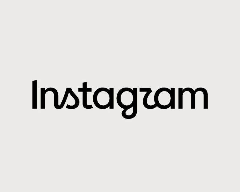
The recent update to Instagram's logo has ignited a vibrant debate among designers, revealing underlying tensions regarding the evolution of design standards. As the platform transitions from its original niche community roots to a global powerhouse, every detail—like its logo—carries significant weight in the eyes of its users.
Instagram, once a haven for creatives and developers, has undergone dramatic transformations since its inception. Founded as a niche mobile app for sharing photos of fine whiskey, its evolution was marked by a rapid shift in audience as cultural icons like Justin Bieber joined the platform in 2011, propelling it into mainstream consciousness.
This week, the mild refresh of Instagram's logo has prompted mixed reactions. The new design features a blend of handwritten and geometric text, a departure from the clean sans-serif fonts that have dominated digital branding for over a decade. While some see this as a refreshing change, others express skepticism about its execution.
Designer Sophie O'Connor voiced her concerns, stating, "The whole thing just feels off to me, like two typefaces arguing with each other." Graphic designer Anna van der Feltz echoed this sentiment, questioning the clarity of the new typeface and humorously noting the potential for viewers to misread it as 'instagzam'.
Brand designer Larry Chikara critiqued the decision to fuse cursive elements with a sans-serif style, suggesting that a clean break from the past would have been more effective. Berenice Howard-Smith raised an important point about accessibility, stating, "There’s an accessibility issue that it could impact many, so it’s not very thoughtful or inclusive." This highlights a broader conversation about the responsibilities of brands in ensuring their designs are easily understood.
Conversely, some argue that the logo's legibility is less critical in a world where brand familiarity often overrides any potential confusion. Senior lecturer Graham Jones noted, "No one is really gonna say 'What's Instagzam?!' unless they've been living under a rock for the last decade." This raises a provocative question: Should accessibility standards differ based on a brand's size and reach?
Despite the backlash, not all designers view the refresh negatively. Many appreciate that the logo is part of a larger design overhaul, which includes new typefaces and an updated visual system that offers more breathing space for content. Jaxanna M., known as Studio Jax, argues that the logo's nuances should be considered in this broader context, where design elements are interwoven to create a cohesive identity.
Among those praising the redesign is art director Alastair McCarley, who sees it as a clever nod to Instagram's heritage while aligning with its vibrant gradient icon. Michael Guerin from Lippincott supports the change as a purposeful evolution, maintaining the personal touch of the script while modernizing the brand's identity to better reflect its shift toward a creator-first platform.
Ultimately, the debate around Instagram's logo is more than a mere discussion about a single letter or design choice; it touches on deeper issues of brand equity, the necessity for thoughtful design evolution, and the context in which logos are assessed. As the creative community wrestles with these complex questions, the divide in opinions may serve as a reminder of the dynamic nature of design and the ongoing dialogue it inspires.
Source: www.creativeboom.com
#branding #creativity #design debate #Instagram #logo design