Instagram's New Logo: A Bold Step into the Future, Says Design Chief
By Editor • August 17, 2026 • 1 min read
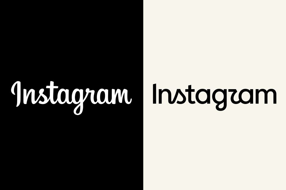
Instagram's recent logo update has sparked a wave of mixed reactions among users, primarily due to the cursive 's' resembling a 'z,' leading to humorous references like 'Instagzam.' Jasmine Probst, Instagram's director of product design, stood by the redesign, emphasizing the need for a fresh look after a decade of the previous mark.
'It’s been 10 years, and the platform has evolved enormously — it was time for a refresh,' Probst stated. She described the new design as 'simpler and bolder' yet retaining a 'handmade feel' to maintain familiarity with users.
Probst acknowledged the criticism regarding readability but expressed pride in the engagement from the community, including memes and adaptations of the new wordmark. 'We’ve truly enjoyed seeing the response from people and other brands,' she remarked. The redesign process involved extensive feedback and collaboration among internal design teams, ensuring a balance between research and creative vision.
With the redesign, Instagram aims to reflect its evolving identity while aligning with Meta's broader branding strategy, focusing on community connection and modern aesthetics.
Source: variety.com