Behind the Scenes of Teddy Blanks' Unique Film Title Designs
By Editor • August 24, 2026 • 2 min read
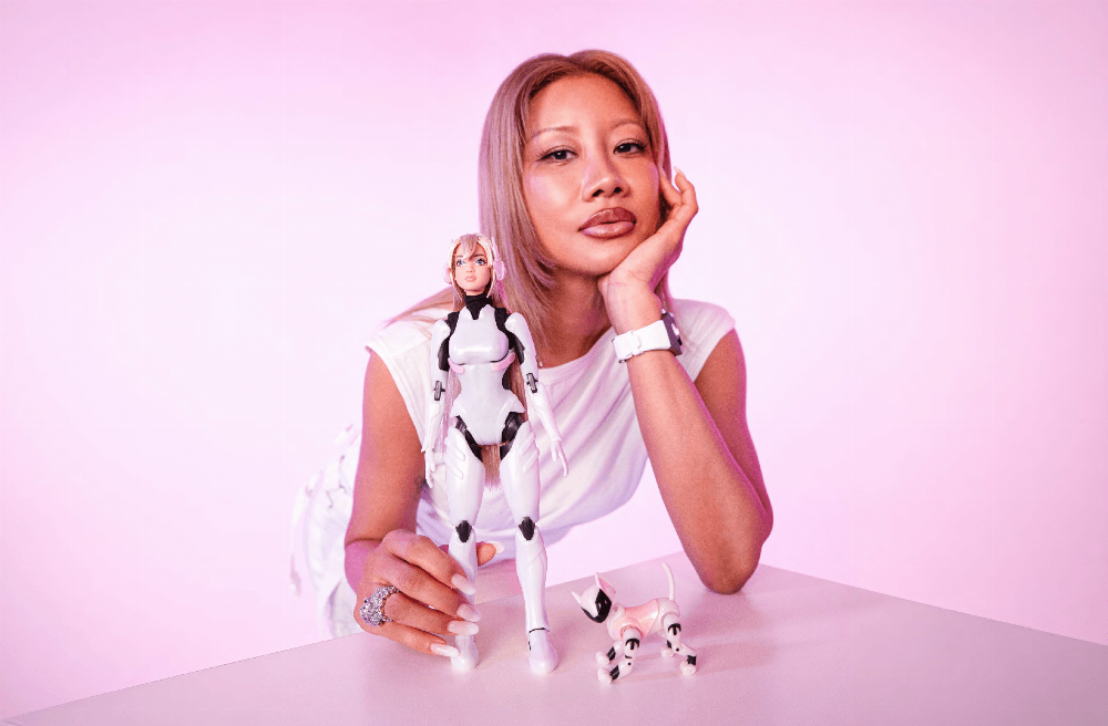
Teddy Blanks, a co-founder of the Brooklyn-based design studio Chips, has carved out a niche in the film industry with his innovative title designs. His journey into this creative realm began with Lena Dunham, who became his first client while they were both students at Oberlin College. "I asked her if I could design the titles for her short films, and she let me experiment freely," recalls Teddy. This early collaboration laid the groundwork for his unique approach to title design.
Blanks, who has worked on films including Greta Gerwig's Barbie and Zach Cregger's upcoming Weapons, sees film titles as a crucial yet often overlooked aspect of storytelling. "Titles are just a contractual obligation, but they can set the mood or create a memorable moment," he explains. He believes that while titles may not determine a film's success, they can enhance the viewing experience.
For the credits of Barbie, Teddy's creative process was particularly hands-on. He meticulously cut and animated high-resolution scans of Mattel's packaging and collaborated with PowerHouse VFX to incorporate animated doll elements. The revival of a long-discontinued Barbie logo was a pivotal part of this project. "I sourced high-res images from a late-80s Barbie magazine to create an accurate digital version of the logo," he states. This attention to detail extended to crafting custom logos for other characters in the Barbie universe, utilizing a collection of vintage dolls he acquired on eBay.
In contrast, Teddy's work on Weapons presented a different challenge. Initially, he crafted an ornate logo that the director deemed too elaborate. He simplified the design, incorporating a triangle symbol from a bell associated with a character in the film. Unbeknownst to him, this triangle within a circle resonated deeply with the film's themes of addiction, as it mirrored the Alcoholics Anonymous logo. "I had no idea about this connection, but it struck a chord with the director," he shares.
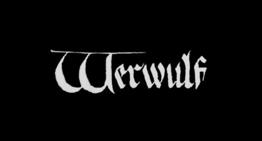
Meanwhile, Teddy's collaboration with director Robert Eggers on Werwulf showcased his ability to blend artistic vision with historical influences. Eggers had a specific 14th-century manuscript in mind for the lettering, which informed the final design. Teddy reinterpreted Eggers’ initial sketches, adding a textured look reminiscent of old paper. "We experimented with different W styles until we found the right one," he recalls. The final product required adjustments based on feedback from the marketing team to ensure clarity without sacrificing the design's artistic integrity.
Source: www.itsnicethat.com