Jif Refreshes Its Brand While Embracing Its Quirky Heritage
By Editor • August 15, 2026 • 1 min read
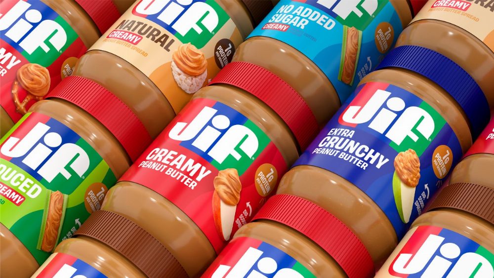
Jif has unveiled its first rebranding in three decades, striking a balance between modernization and maintaining its unique character. Starting this fall, the beloved peanut butter brand will showcase a fresh wordmark, logo, fonts, and photography across its product lineup.
The launch of the campaign “Every Jif’ing Thing” on August 10 highlights the versatility of Jif, showcasing its use in smoothies, yogurt bowls, and even peanut butter noodles. This initiative reflects Jif’s effort to reposition itself beyond the classic peanut butter and jelly sandwich, emphasizing its role as a complement to various snacks.
According to Marketing Dive, while 85% of consumers recognize the familiar red, blue, and green stripes of Jif’s logo, many still associate it primarily with sandwiches. As Jif diversifies its offerings with new products like squeezable tubes, the refreshed look aims to broaden perceptions of the brand.
In a landscape where brand refreshes are common, Jif’s approach stands out for its subtlety. The updated wordmark retains its quirky lettering, ensuring it remains recognizable while appearing more contemporary. Kara Buckler, senior director of creative and design at J.M. Smucker, stated, “With the Jif refresh, we honored the iconic elements people know and love while also invigorating the brand with a cleaner, bolder look.”
Instead of overhauling its logo, Jif opted for minor adjustments, eliminating drop shadows and serifs while keeping its distinctive features intact. This design strategy reflects a growing trend in branding, where companies strive to modernize without sacrificing established equity.
The new packaging photography, showcasing Jif paired with rice crackers, apples, and pretzels, communicates the brand’s expanded identity. The tricolor logo has been resized to give each product a unique label color, enhancing its appeal to a wide audience.
Source: www.fastcompany.com